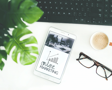
Responsive design continues to evolve as technology advances and user expectations change. The ability to create a seamless experience across various devices is crucial for businesses aiming to engage and retain customers. Here, we explore the latest trends in responsive design that are shaping the digital landscape.
Mobile-First Approach
The mobile-first approach remains a cornerstone of responsive design. With the increasing number of users accessing websites via smartphones, designers are prioritising mobile interfaces. This approach involves designing for smaller screens first and then scaling up for larger devices. The mobile-first strategy ensures that essential content and functionalities are accessible on all devices, providing a more streamlined and user-friendly experience.
Fluid Grids and Flexbox
Fluid grids are no longer just a trend but a necessity. These grids use relative units like percentages instead of fixed units like pixels, allowing the layout to adapt seamlessly to different screen sizes. Flexbox, a CSS3 layout model, complements fluid grids by offering a flexible and efficient way to arrange items within a container. Flexbox simplifies the process of creating complex layouts and ensures that elements adjust gracefully to the available space.
Adaptive Images
Images play a significant role in web design, but they can also slow down a website if not optimised. The use of adaptive images is becoming more prevalent, where images are automatically resized and served based on the user’s device and screen resolution. Techniques like responsive images (using the element and srcset attribute) and SVGs (Scalable Vector Graphics) ensure that images look sharp and load quickly, enhancing the overall user experience.
Minimalistic and Content-Focused Design
Simplicity and clarity are driving modern responsive design. Minimalistic design reduces clutter and focuses on essential content, improving readability and user engagement. This trend involves using ample white space, clean typography, and intuitive navigation to create a more straightforward and enjoyable user experience. The goal is to make the content the star of the show, ensuring users can easily find and consume information.
Dark Mode
Dark mode has gained significant popularity due to its aesthetic appeal and potential to reduce eye strain. Designing for dark mode involves creating a colour scheme that is easy on the eyes while ensuring that all elements are visible and accessible. Many websites and apps now offer a dark mode option, enhancing user experience and providing a modern look.
Micro-Interactions
Micro-interactions are small, subtle animations that enhance user experience by providing feedback and engaging users. These can include hover effects, button animations, or progress indicators. In responsive design, micro-interactions help create a more interactive and intuitive interface, making the user experience more engaging and enjoyable.
Voice User Interface (VUI)
With the rise of voice assistants like Siri, Alexa, and Google Assistant, integrating voice user interfaces (VUIs) into responsive design is becoming more common. VUIs allow users to interact with a website using voice commands, providing a hands-free experience. This trend requires designers to consider how voice interactions will work across different devices and ensure that the interface remains accessible and user-friendly.
Conclusion
Responsive design continues to adapt to the ever-changing digital landscape. By embracing these new trends, designers can create websites that provide a seamless, engaging, and user-friendly experience across all devices. Whether it’s through a mobile-first approach, adaptive images, or the integration of voice interfaces, staying ahead of these trends is crucial for delivering the best possible user experience.
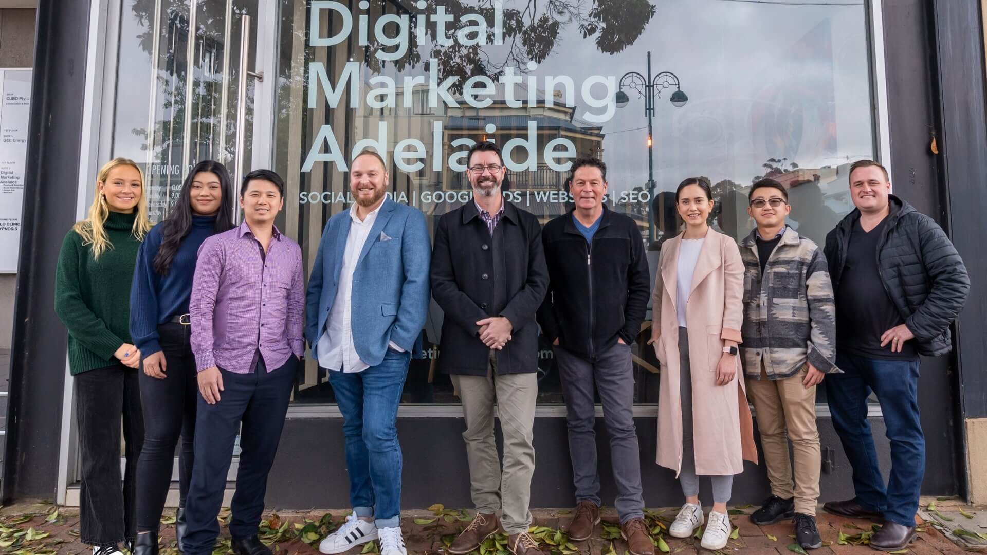
Hello, we are Digital Marketing Adelaide, a local team of digital marketers in Adelaide who specialise in brand awareness, lead generation, and conversions.
Our dynamic digital marketing team of ten, focus on results-driven marketing and helping businesses & brands grow – much to our clients’ delight.


